


 What Is Performance Based Advertising?
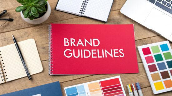
Creating great brand guidelines is all about documenting your brand’s mission, its look and feel, and its voice so everyone on your team is on the same page. But let's be real—too often, they become rigid, impractical PDFs that get lost in a forgotten server folder.
The secret to making them work? Build a living, breathing document that actually empowers your team to be creative within a clear framework.
Table of Contents
Why Most Brand Guidelines Fail (And How to Make Yours Succeed)
We’ve all seen it happen. The traditional brand guideline document is where good intentions go to die. It’s created with a ton of excitement, shared in a company-wide email, and then… crickets. It’s ignored by the very people it’s supposed to help, which is more than just an organizational slip-up; it's a huge missed opportunity for growth.
The root of the problem is that most guides are treated like restrictive rulebooks instead of strategic toolkits. When guidelines feel like a list of "don'ts" or are a pain to find, teams see them as a roadblock. This inevitably leads to inconsistency, which slowly chips away at customer trust and makes your brand less recognizable.
Moving from Rules to Resources
If you want your brand guidelines to stick, you need a complete mindset shift. Think of them less as a set of commandments and more as a practical resource designed to make everyone's job easier. A successful guide doesn't just say, "Don't do this." It shows, "Here’s how to do this brilliantly."
This is where so many companies stumble. A staggering 95% of companies have brand guidelines, yet only about a quarter of them actually enforce them consistently. The financial hit from this is massive—consistent branding can boost revenue by a solid 10-20%. By making your guidelines a user-friendly, go-to resource, you close that expensive gap. If you want to dive deeper into the numbers, check out these insightful branding statistics from Exploding Topics.
A brand guide should be a compass, not a cage. It provides direction and purpose, giving your team the confidence to explore new ideas while staying true to the brand’s core identity.
Take a scaling startup, for example. They can use their new guidelines to finally get marketing and sales aligned. Instead of the sales team whipping up one-off, off-brand presentations, they can pull from a library of approved templates.
Marketing, in turn, can launch campaigns knowing every single touchpoint is cohesive, from a social media post to a major influencer collaboration. This alignment is especially vital when you're mapping out your influencer marketing outreach strategy, as it ensures your partners can authentically represent who you are.
This unified front doesn't just look professional; it builds a powerful, memorable brand experience that drives real business results.
Defining the Core Soul of Your Brand
Before you even think about fonts or color palettes, you have to dig deeper. Way deeper. Truly effective brand guidelines are built on something solid—the core soul of your brand. This isn't about writing a fluffy mission statement for your website's "About Us" page; it's about nailing down the fundamental principles that will steer every single decision you make.
Getting this foundational work right is what separates a brand that feels authentic and real from one that just seems… off. It means asking the tough, strategic questions about your purpose, what you stand for, and the kind of personality you want to show the world. Without that clarity, your visuals and your voice are just guessing.
Start with Your Mission and Vision
Your mission statement is your "why." It's the reason you get out of bed in the morning, beyond just making a profit. Your vision statement is your "where"—the future you're trying to build. These two statements are the North Star for your entire brand.
Don't just slap something together because it sounds good. Actually workshop these with your team. A powerful mission should be so clear and compelling that it rallies your whole organization. For instance, a B2B tech company's mission might be "to empower small businesses with the data insights typically reserved for large enterprises."
See how that immediately informs the brand's direction? It suggests a personality that’s supportive, accessible, and smart. Every piece of content, from a blog post to a sales deck, should feel like it came from that core purpose.
Uncovering Your Core Brand Values
Values are the non-negotiable beliefs that shape your company culture and, more importantly, your actions. They're the promises you make to your customers and your own team. But please, don't just pick generic words like "Innovation" or "Integrity." You have to define what they actually mean in practice.
Your brand values aren't just words on a wall; they're the filter for every decision you make. They dictate how you hire, how you build products, and how you talk to your audience.
Let's stick with that B2B tech company. Here’s how they could break down their values:
- Be Insightful: We don’t just dump data on our clients. We deliver clear, actionable wisdom that actually drives their growth.
- Act as a Partner: Our success is tied directly to our clients' success. We’re in their corner, offering proactive support and guidance.
- Simplify the Complex: We’re obsessed with making powerful technology intuitive and accessible for everyone, no matter their technical skill level.
These are so much better, right? They're action-oriented and give you a much clearer roadmap for behavior and communication than single-word buzzwords. They're tangible.
To help you get started, let's map out the core components of brand identity. Think of this table as your first worksheet—a way to get the foundational ideas out of your head and onto paper before you move on to the more creative stuff like logos and taglines.
Brand Identity Component Breakdown
| Component | Guiding Question | Example (For a Sustainable Coffee Brand) |
|---|---|---|
| Mission | What is our fundamental purpose? Why do we exist? | To connect conscious consumers with ethically sourced, single-origin coffee that supports small-scale farmers. |
| Vision | What future do we want to help create? What is our ultimate goal? | A world where every cup of coffee contributes positively to the planet and its people. |
| Values | What are the non-negotiable principles that guide our actions? | 1. Sustainability First 2. Farmer Prosperity 3. Uncompromised Quality 4. Community Connection |
| Personality | If our brand were a person, what would they be like? | The thoughtful, earthy artisan—passionate, knowledgeable, warm, and grounded. |
| Target Audience | Who are we speaking to? What do they care about? | Eco-conscious millennials (25-40) who value transparency, quality, and brands that align with their ethics. |
By filling this out, you create a powerful reference point. Every future branding decision, from your packaging design to your social media captions, can be checked against these core pillars to ensure consistency and authenticity.
Translating Values into a Brand Personality
Once your mission and values are locked in, you can start shaping your brand personality, sometimes called an archetype. This is where you give your brand human-like traits. If your brand walked into a room, who would it be? For our B2B tech company, with values like "insightful" and "partner," the personality flows naturally: The Insightful Mentor.
This persona guides every single interaction. An Insightful Mentor is patient, wise, and encouraging—never condescending or drowning you in jargon. This personality dictates everything from the tone of voice in a customer support email to the style of photography on the website. This is how you build a character that people can relate to, a critical first step as you build strong brand awareness.
Of course, a huge piece of this puzzle is knowing who you're actually talking to. You can't shape a personality without knowing who will connect with it. That's why it's incredibly helpful to create compelling buyer personas as part of this foundational work.
When you define your brand's soul first, you guarantee that every other element in your guidelines—from your logo to your tagline—is a genuine expression of who you are.
Building Your Visual Identity System
Once you’ve wrestled with the big, abstract ideas and finally nailed down your brand's soul, it's time for the fun part: giving it a face. This is where your brand’s personality stops being a concept in a slide deck and becomes a tangible, recognizable visual system. A well-documented visual identity is your secret weapon for consistency, ensuring that no matter where someone bumps into you—your website, a social ad, or your product packaging—the experience is instantly familiar.
This process is way more than just whipping up a logo. It’s about building a flexible, cohesive toolkit of visual assets. This toolkit needs to be adaptable enough for any context while still being unmistakably yours. Get this right, and you start building the visual muscle memory that makes your brand impossible to forget.
Mastering Your Logo and Its Usage
Your logo is the most concentrated shot of your brand's essence, but a single, static image just doesn't cut it anymore. To actually work in the wild, you need a versatile logo system with crystal-clear rules. This is how you avoid those common (and painful) mistakes that weaken your brand, like a stretched-out logo, weird color swaps, or cramming it into a space where it can't breathe.
Think of it as creating a playbook for your team. You have to define not just what the logo looks like, but how it lives and behaves across every platform imaginable.
- Primary Logo: This is your hero, the main event. It’s the full-color, complete version you'll use most of the time.
- Secondary Variations: What happens when you need to put it on a dark background? Or in a super wide, narrow space? You’ll need alternates like a horizontal version, an all-white (knockout) one, and a simple single-color option.
- Icon or Mark: This is your brand's visual shorthand. It’s perfect for the tiny spaces—think favicons, social media profile pics, or app icons.
Here's a great look at the process of creating and applying a logo to keep everything consistent.
This visual guide shows why logo usage rules aren't just suggestions; they're a core part of a strong identity system.
Beyond just having the different files, your guidelines absolutely must specify clear space rules. This is the minimum "breathing room" required around the logo to keep it from getting lost in the clutter. It's also a smart move to show concrete examples of what not to do, like showing the logo stretched, skewed, or slapped on a busy background. This kind of proactive guidance stops common mistakes before they ever happen.
Building a Versatile and Meaningful Color Palette
Color is one of the fastest, most powerful tools you have for brand recognition. The right palette can trigger specific emotions and create a powerful mental shortcut for your audience. Just think of the iconic Tiffany Blue or the unmistakable red of Coca-Cola—those colors are the brand.
But a functional color palette is much more than one or two primary colors. You need a full spectrum of options to work with.
- Primary Colors: These are the one to three core colors that will carry the most weight and define your brand's visual identity.
- Secondary Colors: These are your complementary players, used for highlighting key info, spicing up subheadings, or adding depth to design elements. They give your palette flexibility.
- Neutral Colors: This includes your shades of grey, beige, or off-white. They’re the foundation for body text, backgrounds, and other subtle uses.
For every single color, you have to provide the specific color codes for both digital and print. This is how you guarantee perfect consistency, no matter where your brand shows up.
Documenting HEX, RGB, and CMYK codes is non-negotiable. This simple step prevents the frustrating inconsistencies that arise when a color looks vibrant on screen but dull and off-brand in a printed brochure.
The data doesn't lie. Research shows that a signature color can boost brand recognition by as much as 80%. And get this: a staggering 90% of snap judgments made about products are based on color alone. Considering that people are more likely to remember a brand's color than its name, defining your palette is a decision with some serious weight. You can dive deeper into these insights on branding and color psychology.
Establishing a Clear Typographic Hierarchy
If color is your brand's look, typography is its voice made visible. The fonts you choose have their own distinct personalities—they can feel modern and clean, classic and trustworthy, or energetic and playful. Your job is to pick a set of fonts that feels true to your brand's soul and then build a clear hierarchy for how to use them.
A solid typographic system does more than just look good; it makes your content a breeze to read and navigate, guiding the reader’s eye exactly where you want it to go.
- Headlines (H1, H2): This is usually a bold, distinctive font that grabs attention and shouts your brand’s personality from the rooftops. It’s for your main titles on web pages, blog posts, and marketing materials.
- Subheadings (H3, H4): This font should play nicely with your headline font but be different enough to create a clear visual break. It’s a lifesaver for breaking up long walls of text.
- Body Copy: For your main text, one thing matters above all else: readability. You need a clean, simple font that’s comfortable to read in smaller sizes for longer stretches.
- Accent Font: You might also want to throw in a special font for things like call-to-action buttons, pull quotes, or other text you really want to pop.
Check out how Starbucks uses typography on its website to create a vibe that's both welcoming and premium.
The screenshot shows a perfect hierarchy. They use a friendly, bold headline font paired with a clean, readable body font that makes you want to dive into the content.
Once you’ve made your font selections, your brand guidelines need to get specific: spell out the exact font, weight (e.g., Bold, Regular, Light), size, and line spacing for each level of the hierarchy. This removes all the guesswork and ensures every single piece of written content looks polished and professional. By defining these visual elements with this level of precision, you’re not just making rules—you're building a robust system that empowers your whole team to create consistently beautiful and effective brand communications.
Finding and Defining Your Brand Voice
How your brand sounds is every bit as important as how it looks. A killer visual identity might get you noticed, but it’s your brand voice—that distinct verbal identity—that actually builds the relationship. This is the personality that comes through in every single word you write, from a splashy ad headline to a simple customer support email.
A lot of people mix up brand voice and tone, but they're two sides of the same coin. It’s easier if you think about it like this:
- Voice is your brand's core personality. It's consistent and doesn't change. It’s who you are.
- Tone is the emotional inflection you use in different situations. It’s how you adapt that personality to a specific context.
Your voice should be a constant, but your tone has to be flexible. Nailing this distinction is the secret to creating a verbal identity that feels authentic but also appropriate for any situation.
Voice vs. Tone: A Real-World Example
Let's imagine a playful, energetic pet food brand. Their core voice is fun, caring, and maybe a little quirky. This is the personality that loving pet owners are drawn to.
Now, watch how their tone shifts based on the situation:
- Instagram Post: Announcing a new line of treats, the tone would be upbeat and exciting. "Get ready to see some serious tail wags! Our new Pawsitively Delicious treats are here to make your pup's day!"
- Product Recall Notice: If a safety issue pops up, that fun voice has to adopt a serious, empathetic, and direct tone. "URGENT: Your pet's safety is our top priority. We are issuing a voluntary recall for our Chicken & Rice formula…"
In both scenarios, it's still the same caring company at its core, but the tone changes dramatically to fit the moment. The personality doesn't just disappear; it adapts. That adaptability is what makes a brand feel human and trustworthy.

Defining Your Core Voice Attributes
To make your brand voice something your team can actually use, you have to get more specific than just "friendly." The trick is to define a few core attributes and then spell out what they do—and don’t—mean in practice. One of the best ways I’ve found to do this is with a "We are X, but not Y" framework.
Let’s go back to our pet food brand and flesh out their voice:
- Playful, but not silly. We use humor and lighthearted language that fellow pet lovers get. We steer clear of childish jokes that might cheapen the quality of our products.
- Knowledgeable, but not academic. We share expert advice on pet nutrition in a way that's easy to digest. We ditch the dense scientific jargon and talk like a trusted friend, not a textbook.
- Caring, but not overly sentimental. We let our genuine love for animals shine through in everything we do. We avoid sappy language that can come across as inauthentic.
This simple exercise brings so much clarity. It creates clear guardrails that help anyone writing for your brand—from a social media manager to a product copywriter—hit the right note every single time.
Your brand voice isn't just about what you say; it's about the feeling you leave behind. A well-defined voice makes your communication memorable and builds a genuine connection with your audience.
Documenting Messaging and Tone for Different Channels
Once you’ve locked down your core voice, the next step is to show how it comes to life across different channels. This is where you move from telling to showing. A simple messaging matrix is a fantastic tool for organizing this information and making it instantly useful for your team.
This has never been more critical. Research shows that around 62% of consumers say a brand’s values heavily influence their buying decisions. That means your verbal identity is just as vital as your visual one. The best brand guidelines now include messaging modules that provide concrete examples of tone across various channels. If you want to dive deeper, you can learn about the latest in brand identity guides on Avintiv Media.
Here’s what a simple messaging matrix could look like:
| Channel | Audience Goal | Appropriate Tone | Example |
|---|---|---|---|
| Email Newsletter | To feel informed and part of our community. | Helpful, Warm, Community-focused | "This month, we're sharing three easy tips to keep your dog's coat shiny and healthy all winter long." |
| Paid Instagram Ad | To be entertained and tempted by a new product. | Energetic, Exciting, Action-oriented | "Warning: may cause uncontrollable zoomies! 🐾 Our new jerky bites are packed with flavor your dog will go wild for. Tap to shop!" |
| Customer Support Chat | To get a problem solved quickly and feel heard. | Empathetic, Clear, Reassuring | "I'm so sorry to hear you're having trouble with your order. Let's get this sorted out for you right away." |
| Blog Post | To learn something valuable about pet care. | Informative, Trustworthy, Engaging | "Understanding dog food labels can be tricky. In this guide, we break down the top five ingredients to look for." |
By laying out these real-world scenarios, you eliminate guesswork and empower everyone in your company to be a confident brand ambassador. This part of your brand guidelines turns the abstract idea of "voice" into a practical, everyday tool that ensures every word works to build a stronger, more consistent brand.
Putting Your Guidelines into Practice
Having a beautifully designed brand guide is one thing, but making it a living, breathing part of your company's daily operations is another thing entirely. The real test isn't how your guidelines look; it's how they're used.
This is where the rubber meets the road—where your strategy gets put into practice across every single touchpoint, from a simple email signature to a massive marketing campaign.
The key is to empower your team, not police them. If the guidelines are seen as a tool for success rather than a restrictive rulebook, people will actually want to use them. That means making the guide accessible, easy to understand, and packed with practical examples that solve real problems.
Adapting Your Brand for Different Channels
Consistency doesn't mean being robotic or rigid. Your brand has to be flexible enough to feel at home on a formal corporate brochure and a playful TikTok video. It's all about adapting your tone and visuals for the context of each platform without losing your core identity.
Take your logo, for example. The primary, full-color version might look incredible on your website header. But you'll need a simplified, single-color icon variant to look sharp as a tiny favicon in a browser tab.
The same idea applies to your brand voice. A B2B company might keep a professional, authoritative voice on its main website but switch to a more conversational and engaging tone on LinkedIn to connect with peers in the industry.
True brand consistency is not about being identical everywhere; it's about being recognizable and authentic in every context. It’s the ability to flex without breaking.
Creating Tangible Brand Assets
To make this all seamless, your guidelines need to be more than just a document—they should come with a full library of ready-to-use templates and assets. Honestly, this is the most effective way to keep day-to-day communications on-brand without needing a designer to approve every little thing.
This library should be full of the practical, everyday tools your team actually needs to do their jobs.
- Digital Assets: Think templates for email signatures, presentation decks (like Google Slides or PowerPoint), social media post graphics, and digital ad banners.
- Print Materials: If you do any print, include templates for business cards, letterheads, brochures, and event signage.
- Content Creation: For your marketing and content teams, giving them access to pre-approved stock photography, icon sets, and video title card templates can be a total game-changer.
This approach transforms your guidelines from a theoretical document into a practical toolkit. It saves a ton of time, reduces friction, and gives everyone the confidence to create on-brand materials on their own.
Fostering Brand Stewardship and Training
Just publishing your guidelines and hoping for the best is a recipe for failure. A successful rollout requires you to be proactive with training and communication. I always recommend holding a company-wide meeting to walk everyone through the new guidelines, explaining the "why" behind the decisions, not just the "what."
Make sure everyone knows where to find the guide and the asset library. A central, easy-to-find location—like a company intranet or a shared cloud folder—is absolutely critical.
This is especially important for anyone creating content or working with external partners, like influencers. Clear guidelines are essential for keeping the message unified. For those just getting started in that world, our guide on how to find TikTok influencers is a great resource for finding creators who will actually align with your brand.
Finally, designate a "brand champion" or a small committee to answer questions, give feedback, and manage future updates. This gives everyone a clear point of contact and ensures the guidelines evolve with your company instead of gathering digital dust. When you actively teach and support your team, you create a culture where everyone feels a sense of ownership and pride in the brand.
Common Questions About Brand Guidelines

So, you’ve put in the hard work and built out your brand guidelines. That’s a huge step. But once the dust settles, a whole new set of questions usually pops up. How do you keep the document from getting stale? What’s the real difference between a "style guide" and "brand guidelines," anyway?
Let's dive into some of the most common questions I hear from teams. Getting these things straight will help make sure your guidelines don't just become another file lost on a server, but a tool that actively helps your brand grow.
How Often Should I Update My Brand Guidelines?
Think of your brand guidelines as a living document, not a stone tablet. It needs to breathe and evolve with your business. I always recommend scheduling a formal review at least once a year. This annual check-in is the perfect time to make sure everything still lines up with your business goals and how you’re positioned in the market.
Now, that doesn't mean you need a massive overhaul every year. Big changes are usually only necessary during a full rebrand or a major strategic pivot.
What’s far more common—and perfectly healthy—are small, iterative updates. Maybe you need to add a new logo format for your TikTok profile, or you want to refine your messaging for a new product launch. These little tweaks are what keep the document relevant day-to-day.
The key is to have a process. Assign a clear owner—like a brand manager or marketing lead—who is responsible for tracking, communicating, and documenting every single change.
Style Guide vs. Brand Guidelines: What Is the Difference?
People throw these terms around interchangeably all the time, but they really aren't the same thing. Nailing down the difference is crucial if you want documentation that actually covers all your bases.
Here's the simple breakdown:
- A style guide is tactical. It's focused on the rules of execution. It answers the "how-to" questions: What are our headline capitalization rules? What are the exact hex codes for our secondary colors? How do we format blog post images?
- Brand guidelines are strategic. This is the big-picture document. It contains the style guide, sure, but it's built on the foundational "why" of your brand—your mission, your core values, your brand personality, and your promise to the customer.
A style guide tells your team how to create something. Brand guidelines explain why it needs to look, feel, and sound that way in the first place.
Essentially, the brand guidelines provide the soul, and the style guide provides the playbook for expressing it correctly.
Should I Create Brand Guidelines Myself or Hire a Designer?
This is the classic DIY-or-delegate question, and in my experience, the best answer is almost always "both."
You absolutely should start the strategic work internally. No one knows your company's mission, vision, and values better than you and your team. Hammering out your brand personality and core messaging is something that requires that deep, internal knowledge.
But when it's time to translate that strategy into a polished visual system—the logo, color palette, typography, and all the functional assets—hiring a professional designer is one of the best investments you can make. They bring a trained, objective eye and the technical skill to build a system that not only looks great but works flawlessly everywhere, from a billboard to a tiny app icon.
The most powerful brand guidelines I've ever seen came from a tight collaboration between the internal team that owned the strategy and a talented designer who brought it to life. This hybrid approach makes sure your guidelines are authentic to your core and executed at a professional level.
Ready to connect with creators who can bring your new brand guidelines to life? JoinBrands is an all-in-one platform that connects you with over 250,000 talented creators, from UGC producers to TikTok Shop affiliates, to create authentic content that resonates. Find the perfect creators for your brand today.