


 What Is an Influencer Marketing Agency and Do You Need One?
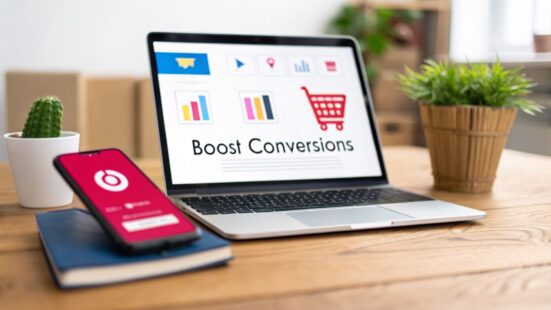
To really boost your ecommerce conversion rate, you need a solid plan. It's about more than just a few tweaks here and there. I've seen brands transform their sales by focusing on three key areas: finding and fixing leaks in their sales funnel, using social proof to build trust, and making sure the mobile checkout process is absolutely seamless. If you can dial in these three things, you're not just getting more clicks—you're turning browsers into loyal customers.
Table of Contents
Where to Start for Higher Ecommerce Conversions
Before you start A/B testing button colors or obsessing over headlines, let’s talk about what a “good” conversion rate even is. So many brands get hung up on chasing a universal average, but that's a huge mistake. The truth is, conversion rates are all over the place depending on your industry, what you sell, and how much it costs.
To really get ahead in ecommerce, you have to get familiar with conversion rate optimization best practices that apply to your business. Sure, the global average ecommerce conversion rate sits around 2.1%, but that number is just a compass, not a destination. For direct-to-consumer (DTC) brands, these benchmarks are your first step in setting realistic goals.
Understanding Industry Benchmarks
What really matters is how you stack up against your direct competition. Context is everything.
For example, a personal care brand could be crushing it with a 6.8% conversion rate, while a home decor store might be wildly successful at just 1.4%. Why the huge difference? Buying behavior. Someone might impulse-buy a new lip gloss but take weeks to decide on a couch. The price point and consideration time change everything.
This chart really drives home how different the numbers can be across industries.

As you can see, a "good" conversion rate isn't one-size-fits-all. It's a spectrum, and it all comes down to what you're selling. That’s why your first move is always to figure out your own baseline.
To help you get a sense of where you stand, here’s a quick look at some average conversion rates across different ecommerce sectors.
Ecommerce Conversion Rate Benchmarks by Industry (2026 Data Outlook)
This quick reference table shows average conversion rates across different ecommerce sectors to help you benchmark your store's performance.
| Industry | Average Conversion Rate (%) |
|---|---|
| Personal Care & Beauty | 6.8 |
| Food & Beverage | 4.9 |
| Fashion & Apparel | 2.4 |
| Consumer Electronics | 2.1 |
| Home Decor & Furnishings | 1.4 |
Use these numbers as a starting point to see how your store stacks up. If you're below your industry's average, you know there's room to grow. If you're above it, great—now the goal is to keep pushing that number higher.
Defining Your Core Optimization Pillars
Once you know your benchmark, you can focus your energy where it counts. I always come back to these three pillars because they deliver the biggest wins.
- Diagnose Your Sales Funnel: You have to become a data detective. Before you change anything, you need to know exactly where you’re losing people. Is it on the product page? In the shopping cart? During the final checkout steps? Your analytics hold the answers.
- Optimize with Social Proof: Today's shoppers are smart and skeptical. You have to earn their trust, and there’s no better way to do that than with authentic user-generated content (UGC), real reviews, and creator marketing. It’s non-negotiable.
- Master the Mobile Experience: The majority of your traffic is probably coming from smartphones. A clunky, confusing mobile checkout is the fastest way to kill a sale. A smooth, frictionless mobile experience isn’t a nice-to-have anymore; it's a must-have.
Pro Tip: Don't try to fix everything at once. Dive into your data and find the single biggest leak in your sales funnel. Focusing all your effort there first will give you much better results than spreading yourself too thin. A practical example is focusing solely on reducing cart abandonment for a full quarter if you see a 70% drop-off there, rather than also trying to optimize product page add-to-carts at the same time.
This structured approach makes sure your optimization efforts are strategic and backed by data right from the start. For more ideas, check out our guide covering 10 proven ecommerce growth strategies.
Find and Fix Critical Sales Funnel Leaks

Before you can figure out how to increase conversion rate ecommerce-style, you have to put on your detective hat. Lost revenue doesn't just disappear at the payment step. It’s seeping out from tiny cracks all over your sales funnel, often long before a customer even thinks about their credit card. Your job is to find those leaks.
Trying to boost conversions without a deep dive into your customer journey is like patching random spots on a wall to fix a leaky pipe. You might get lucky, but you're more likely to waste a ton of time and money. The only real fix is to trace the problem back to the source.
Visualizing the Customer Journey with Funnel Reports
First things first: you need to map out the exact path shoppers take on your site, from the second they land on a page to the final "thank you" message. This is where a funnel exploration report, a killer feature in tools like Google Analytics 4 (GA4), becomes your best friend.
This report gives you a visual breakdown of how users move through a series of steps you define. A classic e-commerce funnel looks something like this:
- Viewing a product page
- Adding an item to the cart
- Initiating checkout
- Completing the purchase
Once you set this up, you can see the precise drop-off rate between each stage. Maybe you discover that while 80% of visitors see a product, a measly 10% actually add it to their cart. That’s a huge leak, and it gives you a very specific problem to solve: Why aren't people adding to cart?
Pro Tip: Don't stop at one generic funnel. You need to build separate funnels for different traffic sources (like organic search vs. social media ads) and device types (mobile vs. desktop). A shopper who clicked a TikTok ad on their phone is in a completely different mindset than someone who searched for your brand on a laptop. You might find that mobile users from ads drop off if the product page takes too long to load, while desktop users from organic search drop off at the shipping cost step.
Uncovering Hidden Friction with Behavioral Analytics
Funnel reports are great for showing you where users are leaving, but they don't always tell you why. For that, you need to bring in behavioral analytics tools like heatmaps and session recordings.
Heatmaps give you a visual summary of user behavior, showing exactly where people click, how they move their mouse, and how far they scroll. If your 'Add to Cart' button is "cold" (blue), it's probably not visible or compelling enough. If you see a "hot" (red) spot on something that isn't even a button, you've just found a point of user frustration.
Session recordings take this a step further. These are literally screen recordings of real user visits, letting you watch their entire journey unfold. You can see them hesitate on a form, rage-click a broken link, or get lost trying to find shipping info. It's like looking over their shoulder.
A Real-World Example of Plugging a Leak
Let's say you run a DTC apparel brand. You look at your GA4 funnel and see a massive 40% abandonment rate on the cart page. People are adding your clothes to the cart, but something is scaring them off before checkout. That's a critical leak hemorrhaging cash.
To figure it out, you jump into your session recording tool and filter for users who abandoned their carts. After watching just a dozen recordings, a pattern emerges: users click the shipping cost estimator, punch in their zip code, and then…poof. They're gone.
You realize your shipping calculator is a mess. It shows three different options without clear delivery times, and the "Free Shipping" offer is buried.
With that insight, you can form a real hypothesis: "Simplifying our shipping options and making the free shipping threshold obvious will reduce cart abandonment." Now you have a specific, data-backed problem to attack. Your A/B tests are no longer random guesses—they're targeted solutions, and that's the core of smart conversion optimization.
Transform Product Pages with Creator Content
Your product pages are where the sale is won or lost. They have to do more than just list features next to sterile, studio-shot images. A product page that truly converts sells a feeling. It answers questions before they’re even asked and builds a layer of trust that turns a hesitant "maybe" into a confident "Add to Cart."
This is where authentic creator content becomes your secret weapon.
By moving beyond standard product photography, you can transform a static listing into a dynamic, trust-building experience. The goal is simple: replace shopper uncertainty with undeniable social proof. Imagine a potential customer seeing a real person—someone just like them—unboxing, using, and loving your product. That's a connection a professional photoshoot can rarely replicate.
Bridge the Trust Gap with Authentic UGC
Modern shoppers are smart. They can spot a polished, professional product shot from a mile away and know it’s designed to sell. What they really trust is a genuine video from another customer. Integrating user-generated content (UGC) directly onto your product pages is one of the most powerful things you can do for your conversion rate. It’s instant, unbiased validation.
This is especially true for any product where fit, texture, or real-world performance is a major question. For a clothing brand, this means tackling sizing anxiety—a notorious conversion killer—by showcasing a gallery of customer photos and videos.
- Display a mix of body types: Feature creators of different heights and sizes wearing the same piece. This helps shoppers actually see how it might look on them, not just a size-zero model.
- Showcase different skin tones: For makeup or skincare, nothing beats user-submitted photos in various lighting conditions. It's infinitely more helpful than a single, Photoshopped swatch.
- Highlight diverse use cases: A backpack brand can show UGC from a student on campus, a hiker hitting the trail, and a commuter on a train. This demonstrates versatility in a way a product description never could.
Pro Tip: When a shopper sees someone who looks like them using and enjoying your product, their purchase anxiety plummets. Research shows that including customer reviews and photos can boost conversion rates by as much as 270%. It makes the purchase feel less like a gamble and more like a safe bet. A practical example is to add a UGC gallery from a tool like Yotpo or Loox directly below your main product photos, making social proof impossible to miss.
Use Creator Videos to Answer Questions Visually
Videos are absolute gold for demonstrating value and squashing customer objections before they even fully form. While you still need high-quality product photos, short and authentic videos from creators fill in the gaps and bring your product to life.
Think about the top three questions your support team has to answer every single day. Now, what if you used creator videos to answer those questions right on the product page? You'd not only cut down on support tickets but also remove critical friction from the buying journey.
Pro Tip: Add a "How it Works" or "See it in Action" section to your product pages and fill it with short, punchy videos from influencers or happy customers.
- A kitchen gadget brand could feature a 30-second clip of a creator whipping up a quick recipe.
- A furniture company could embed a time-lapse of a customer easily assembling that new desk.
- A tech brand can show a real user setting up a new device straight out of the box.
These videos don't need to be Hollywood productions; in fact, their raw authenticity is their biggest strength. If you want a deeper look at how this type of content works, check out our detailed breakdown of user-generated videos and their direct impact.
Streamline Your Visuals for Maximum Impact
While UGC is incredibly powerful, you still need clean, professional product images to maintain a polished brand feel. It’s all about striking the right balance. Your hero images should be crisp and clear, but they can be supplemented with more relatable creator content further down the page.
For apparel brands, a great way to get that professional look without a massive photoshoot budget is the ghost mannequin effect. This technique involves compositing multiple shots to make it look like the clothing is being worn by an invisible person. For teams looking to produce these visuals efficiently, you can even use an AI Ghost Mannequin Generator to speed things up.
By combining polished main images with a rich gallery of authentic creator content, you give shoppers the best of both worlds. You project a professional brand image while building the deep, human trust needed to drive sales. This approach transforms your product page from a simple catalog entry into a powerful conversion machine.
Master the Mobile Checkout Experience

If you're serious about figuring out how to increase conversion rate ecommerce style, your phone should be the first place you look. With most of your customers browsing on mobile, a clunky, slow, or confusing experience isn't just an annoyance—it's actively costing you sales.
The data tells a pretty clear story here. Mobile traffic now makes up a staggering 71% of all e-commerce site visits. But the conversion rate? It hovers around a measly 2%, lagging way behind desktop's 3%. This gap is a massive missed opportunity, especially when mobile commerce is expected to hit $4 trillion in sales by 2025.
Considering 79% of mobile users are making purchases directly on their phones, fixing this experience is one of the biggest levers you can pull. You can dig deeper into these trends by checking out the latest ecommerce statistics.
Beyond Basic Responsiveness
Look, having a "mobile-friendly" site is table stakes now. It’s not enough. A truly optimized experience is built with a mobile-first mindset. It’s more than just making sure your desktop site doesn’t break on a smaller screen; it’s about anticipating how a mobile shopper actually behaves.
Think about it from their perspective. They're probably distracted, maybe on the go, and using their thumbs to get around. Patience is thin for slow load times, complicated forms, and endless scrolling. Your mission is to hunt down and eliminate every single point of friction.
Here are the core areas to focus on:
- Thumb-Friendly Design: All your critical buttons—especially 'Add to Cart' and 'Checkout'—need to be easy to tap with a thumb. Think about the "thumb zone" at the bottom and sides of the screen. Placing your key CTAs there can make a real difference.
- Simplified Forms: Nobody enjoys typing out their full address and credit card info on a tiny keyboard. Use address auto-fill, enable payment autofill, and only ask for the information you absolutely need. Every field you can cut is a potential win.
- Frictionless Payments: This one is non-negotiable. If you’re not offering digital wallets like Apple Pay, Google Pay, and Shop Pay, you are leaving money on the table. These tools create a one-click purchase, completely bypassing the tedious manual entry that causes so many people to drop off.
Pro Tip: Go through your own mobile checkout process right now. But don't do it on your perfect office Wi-Fi. Do it like a real customer—on a spotty connection, while getting "distracted" halfway through. See if you can easily pick up where you left off. This simple exercise will quickly show you exactly where the frustrating parts are. For example, you might discover that your session times out after 10 minutes, forcing a customer who was interrupted to start all over again.
Streamline Your Mobile Checkout Flow
One of the most impactful changes you can make is to radically simplify the checkout process itself. That traditional, multi-page checkout (Cart -> Shipping -> Billing -> Review -> Purchase) is a notorious conversion killer on mobile devices. Every new page you load is another chance for a customer to get frustrated and bail.
I saw this firsthand with a beauty brand struggling with a sky-high mobile cart abandonment rate. Their checkout was five separate pages long. We implemented two simple changes that cut it down to a single, clean page.
First, we made guest checkout the default, getting rid of the "create an account" barrier. Second, we put the one-click payment options like Apple Pay right at the top, making them impossible to miss.
The result? Their mobile checkout abandonment rate plummeted by 25% in the first month. That single optimization project created an immediate and significant revenue lift, all from just removing a few unnecessary steps.
Engage Mobile Users with Vertical Video
Your mobile strategy shouldn't stop at the checkout. Your product pages need to be built for how people actually use their phones—which means thinking vertically. This is where creator-sourced content really shines.
Instead of just static product photos, start embedding vertical videos like TikToks, Reels, and Shorts directly onto your product pages. These short, authentic clips feel native to the mobile experience.
A creator unboxing your product or showing it in a real-world setting builds instant trust and visually answers questions that a hesitant browser might have. It's one of the best ways to turn a mobile scroller into a confident buyer.
Build a Data-Driven A/B Testing Program
Throwing random changes at your website and hoping for the best isn't a strategy—it's a lottery ticket. If you really want to figure out how to increase conversion rate ecommerce-wise, you have to stop guessing. It's time to build a structured optimization program that relies on data, not gut feelings.
This means shifting your team's mindset from "I think this will work" to "Let's test this and find out." True growth comes from a constant cycle of testing, learning, and iterating. This isn't about one-off tests; it's about building an engine for consistent improvement.
Prioritize Your Tests for Maximum Impact
You can't test everything at once. Trying to will just burn out your team and leave you with messy, inconclusive data. The key is focusing your energy where it will actually move the needle. A simple prioritization framework like PIE is perfect for this.
The PIE model helps you score test ideas based on three simple factors:
- Potential: How much room for improvement is there? High-traffic pages with low conversion rates are your gold mines.
- Importance: How valuable is the traffic to this page? A test on your checkout page is always more important than one on your "About Us" page.
- Ease: How difficult is this test to implement? Think about the time and technical resources required.
Score each idea on a scale of 1-10 for all three categories. This quickly shows you the low-hanging fruit—the high-impact, easy-to-implement changes that will deliver the fastest results.
Pro Tip: Always start with your most critical pages. A tiny lift on a product page or in the checkout flow will almost always bring in more revenue than a huge lift on a blog post. Your own analytics will point you straight to these valuable pages. For example, improving the add-to-cart rate on your top 10 product pages by 5% is far more valuable than doubling conversions on a low-traffic landing page.
Crafting a Strong Hypothesis
Running a test without a clear hypothesis is just a shot in the dark. Every A/B test needs a structured statement that defines what you're changing, what you expect to happen, and—most importantly—why. This is what keeps your testing focused and makes the results easy to understand.
A solid hypothesis looks like this: "By changing [Independent Variable] for [Target Audience], we will achieve [Expected Outcome] because [Rationale]."
- Practical Example: "By changing the CTA button text from 'Submit' to 'Get My Free Skincare Guide' on our pop-up for first-time visitors, we will increase email sign-ups because the new copy clearly communicates the value they're getting in return."
This structure forces you to think about the user psychology behind the change. It elevates the conversation from "Let's try a green button" to "We believe a green button will stand out more against our blue background, drawing more attention and leading to more clicks."
Analyze Results and Avoid False Positives
Once your test is live, the real challenge begins: knowing when to stop it and how to read the data. It's incredibly tempting to call a winner after a few days, but that's a classic mistake that leads to false positives.
You have to let the test run long enough to reach statistical significance, which is typically a 95% confidence level. This means you can be 95% certain that your changes caused the result, not just random chance. Most A/B testing tools like VWO or Optimizely will calculate this for you.
Don't forget about the basics, either. Your site's technical performance is a huge conversion factor. E-commerce sites that load in 1 second see conversion rates that are 3 times higher than sites that take longer to load. This makes site speed a foundational part of any CRO strategy.
Building a structured testing program is a long-term commitment, but it’s the only reliable way to create a brand that gets better over time. To see how these tests translate into overall success, you might be interested in our guide on understanding key content performance metrics.
Your Top Ecommerce Conversion Questions, Answered
As you start optimizing your store, you're bound to run into some common roadblocks. Let's tackle a few of the biggest questions that pop up for ecommerce managers and marketers trying to boost their numbers.
What Is a Good Conversion Rate for a New Ecommerce Store?
It’s easy to get obsessed with conversion rates right out of the gate, especially when you see industry averages floating around. For a brand-new store, hitting a conversion rate between 1-2% is a healthy and realistic starting point.
Remember, those higher global averages include massive, established brands with years of built-up trust and name recognition. Your first few months aren't about matching them; they're about gathering data. Instead of chasing a generic number, look at your specific industry. A personal care brand might see averages over 6%, while a store selling high-ticket home furnishings could be closer to 1.4%.
Pro Tip: For a new store, the most important metric isn't your conversion rate—it's the improvement of that rate. A "good" rate is one that climbs month after month because you’re finding and fixing friction points based on what your actual user data is telling you. A practical goal would be to aim for a 10% month-over-month increase in your conversion rate for the first six months.
How Can I Use UGC to Increase Conversions on a Tight Budget?
You absolutely do not need a massive marketing budget to get powerful user-generated content (UGC). In fact, some of the most authentic, high-converting content comes from grassroots efforts that cost next to nothing.
A simple place to start is by incentivizing your existing customers. Try offering 10% off their next purchase if they submit a photo or video with their product review. It's a small investment that can kickstart a steady flow of valuable content.
- Actively Monitor Socials: Set up alerts for your brand and product names. When you spot customers posting about their new purchase, reach out! Ask for permission to feature their content on your site. Most people are thrilled to get a shout-out.
- Embrace Realism: A couple of genuine customer photos on a product page often build more trust than a dozen polished, professional shots. Shoppers want to see real people using your products in their own lives.
- Connect with Micro-Creators: For a very small investment, you can use a creator platform to find micro-influencers. Many are happy to create fantastic UGC in exchange for free products, giving you authentic assets without a big cash outlay.
The whole game is about making it easy for customers to share and rewarding them when they do. This creates a powerful flywheel of social proof that melts away purchase anxiety and builds serious shopper confidence.
What Single Change Has the Biggest Impact on Conversion Rate?
While there's no magic "silver bullet" that works for every single store, two areas consistently deliver the biggest and most immediate wins: site speed and mobile checkout optimization. They might not be the flashiest updates, but they are the absolute foundation of a solid user experience.
The data doesn't lie: ecommerce sites that load in under one second can see conversion rates up to 3 times higher than slower sites. Every single second of delay directly translates to lost sales. This effect is even more pronounced on mobile, which is likely where most of your traffic is coming from anyway.
A clunky, confusing mobile checkout is also one of the top reasons for cart abandonment. Every extra field, every unnecessary click, and every moment of confusion is another opportunity for a motivated buyer to just give up.
Before you sink money into a major redesign, try these two things first:
- Run a speed audit: Use a tool like Google PageSpeed Insights to get a clear picture of what’s slowing down your mobile and desktop experience. A practical fix is compressing all your product images, which often provides the quickest speed boost.
- Test your own mobile checkout: Seriously, grab your phone and buy something from your own store. Was it fast? Was it easy? How many taps did it take? Be honest.
Adding guest checkout and one-click digital wallets like Apple Pay or Google Pay are two of the highest-impact moves you can make. They slash friction at the most critical moment of the buying journey and can give you an immediate conversion lift.
Ready to amplify your brand's social presence and drive more sales with authentic creator content? JoinBrands connects you with over 250,000 creators, including TikTok Shop Affiliates and Instagram influencers, to produce high-impact UGC that converts. Start your campaign today and see the difference creator marketing can make.