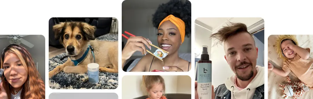


 Your Guide to Marketing for Beauty in 2026
When you're trying to get your brand or content to shine on Instagram, nailing the image size is your first, most crucial step. Think of it as the foundation. To get the best results, you should always aim for a width of 1080 pixels for any standard feed post. Why? It's the magic number that stops Instagram from squashing your quality.
For portrait posts, the sweet spot is 1080px by 1350px, which gives you a 4:5 aspect ratio. This is a big deal because it takes up the most screen space on a phone, grabbing more attention as people scroll.
Table of Contents
Your Quick Reference for Instagram Image Sizes in 2026
Getting the correct Instagram image size sorted out is the first hurdle to clear if you want a professional and eye-catching feed. While Instagram is flexible with different orientations, a few specific dimensions have become the unofficial standard for anyone serious about making an impact.
The one rule to live by is to keep your image width at 1080 pixels. This prevents Instagram's aggressive compression from kicking in and making your beautiful shots look blurry or pixelated.
This infographic breaks down the main post types you'll be dealing with day-to-day.

As you can tell just by looking at it, that tall portrait orientation gives you the most vertical real estate, making it a powerful tool for stopping the scroll.
Instagram Image Post Size Quick Reference (2026)
Here's a quick lookup table with the essential specs for your feed images. Keep this handy when you're exporting your content.
| Post Type | Recommended Pixels (Width x Height) | Aspect Ratio | Best For |
|---|---|---|---|
| Portrait | 1080 x 1350px | 4:5 | Maximizing screen space in the feed; ideal for grabbing user attention. |
| Square | 1080 x 1080px | 1:1 | Classic grid aesthetic, carousels, and cross-posting from other platforms. |
| Landscape | 1080 x 566px | 1.91:1 | Wide-angle shots and certain ad formats; less common for organic feed posts. |
Mastering these dimensions ensures your content looks exactly as you designed it, without any surprise cropping or quality loss.
Key Dimensions to Know
Each of these formats serves a different purpose, whether you're trying to build a cohesive grid or show off a detailed product shot. Here’s what you need to remember:
- Portrait Posts (4:5): Your go-to size should be 1080 x 1350 pixels. This format absolutely dominates the mobile feed. It fills up more of the screen than any other shape, and I’ve consistently seen it lead to better engagement.
- Square Posts (1:1): This is the classic Instagram look, sized at 1080 x 1080 pixels. It's perfect for creating those clean, symmetrical carousels or when you're repurposing content from other places where square is standard.
- Landscape Posts (1.91:1): For this one, use 1080 x 566 pixels. Honestly, it's not very common for organic posts because it has such a small footprint in the feed. However, it’s still useful for specific ad formats or when you have a killer wide-angle photo that just won't work any other way.
Pro Tip: Always export your final images with a 1080px width. If you upload something bigger, Instagram will shrink it and likely make it look fuzzy. If you upload a smaller image, the platform will stretch it out, which kills the sharpness.
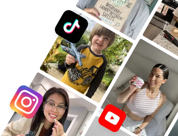
Getting these sizes right means your content shows up exactly how you intended, every single time. And while these specs are your key to Instagram, it's smart to optimize for other platforms, too. You can check out our guide on TikTok ad specifications to make sure your visuals are on point everywhere.
To really get a handle on the best Instagram image sizes for today, it helps to look back at how we got here. Instagram’s dimensions have never been set in stone; they’ve shifted over time based on how we use our phones and what we like to see. This journey gives you the inside scoop on why some formats just work better now.
When Instagram first hit the scene in 2010, it was all about one thing: the perfect 1:1 square. Back then, images were a tiny 612 x 612 pixels. This forced everyone to awkwardly crop their photos, a creative headache that drove photographers crazy. The square was iconic, for sure, but totally impractical.
The Shift to Vertical Content
The first massive change landed in 2015 when the platform finally broke free from its square-only rule. Instagram added support for both landscape and portrait photos, a huge nod to how people were actually taking pictures on their phones. This was the real beginning of the move toward vertical-first design.
This evolution wasn't random; it was all about mobile. Before 2015, that rigid 1:1 square at 612 x 612 pixels made a mess of landscape and portrait shots. By embracing 1.91:1 landscape and 4:5 portrait ratios, alongside the classic 1080 x 1080 px square, Instagram was finally catching up to the way we scroll.
Lately, the platform has doubled down on vertical content that fills more of the screen, which keeps users glued to their feeds longer. For brands using platforms like JoinBrands, this means vertical 4:5 posts (1080 x 1350 px) are still the top dog. In e-commerce campaigns, they pull in way more engagement than squares because they feel more like the full-screen experience of Reels and Stories. You can dig into these trends by checking out more on modern post sizes.
Embracing the Taller Grid
The latest, and arguably biggest, update was the overhaul of the profile grid. For years, your grid just showed square previews of your posts. Now, it shows a much taller 3:4 preview. This move is a clear signal that Instagram is all-in on vertical content, rewarding creators who optimize for those taller formats.
Knowing this history—from tiny 612px squares to the new 3:4 grid—helps you make smarter moves. The platform's direction is obvious: taller content that takes up more mobile screen real estate gets prioritized. That directly impacts how many people see your posts and engage with them. Choosing the right Instagram image size isn't just about following specs; it's about aligning your creative with over a decade of user-focused evolution.
How to Master Vertical Posts for Maximum Engagement
While Instagram still plays nice with a few different post shapes, the vertical portrait post is the undisputed king of engagement. Seriously. This format—specifically the 4:5 aspect ratio at 1080 x 1350 pixels—is your secret weapon for stopping the scroll and actually grabbing someone's attention.
The reason it works so well is simple: screen real estate. On a phone, a 4:5 image just fills up more of the screen than a square or landscape photo. That extra visibility keeps your content in front of a user's eyes for longer, giving your message, product, or call-to-action more time to sink in.

This vertical format has become the go-to for feed posts, boosting visibility by a whopping 33% compared to a classic square post. That increase directly translates to better average view times and higher click-through rates, which is a huge deal for e-commerce brands showing off products. If you need some visual fuel, check out our guide on creative ideas for a photoshoot.
Composing for the 4:5 Frame
Making great vertical posts isn't just about resizing an image. You really have to compose your shot with the 4:5 frame in mind right from the start.
- Lead the Eye: Use leading lines and other visual cues to guide the viewer’s gaze up or down the frame. Make that vertical space work for you.
- Focus on the Subject: Put your main subject—a person, a product, a key message—right in the center. This makes sure it's the first thing people see.
- Mind the "Safe Zone": Even though the full 1080 x 1350 pixels are visible in the feed, keep your most important elements away from the absolute edges. You don't want them getting cut off or hidden by UI elements.
Since 2025, Instagram's 4:5 vertical post has become the standard, taking up more screen space and boosting performance for e-commerce. It expands visibility by 33% over squares and aligns with the 85% of users who browse in portrait mode, leading to higher click-through rates for product-focused content.
Actionable Tips for Brand Success
For brands, getting the vertical Instagram image post size right is non-negotiable for performance. Here’s how to put it into practice:
- Product Showcases: Use that extra height to show off products with more context and detail. For fashion, that means you can finally fit in full-body shots. For home goods, it means showing the product in a beautifully styled scene.
- Clear Calls-to-Action: Place your CTA text or buttons in the lower-middle part of the image. This is a natural resting spot for the thumb during scrolling, making it almost effortless for users to tap.
- Creator Campaigns: When you're working with influencers, make the 4:5 format a required deliverable. This ensures the content they create for your brand is already optimized for the best possible engagement and reach.
Mastering vertical posts is a huge piece of the puzzle, but it's even more powerful as part of a holistic approach to optimizing your Instagram account for your online store. By consistently using the 1080 x 1350px format, you're aligning your entire content strategy with how people actually use the app, giving your brand a clear advantage in a very crowded feed.
Optimizing for the New 3×4 Profile Grid
Instagram's shift to a taller 3:4 profile grid was a massive win for anyone serious about curating a strong visual aesthetic. This update completely changes how visitors first see your images on your profile, making it a critical piece of your content strategy. Before, the grid showed square previews, which often meant awkwardly cropping the sides of your carefully composed vertical posts.
Now, with the grid displaying a taller 3:4 preview, a specific instagram image post size has become the gold standard for perfectionists: 1080 x 1440 pixels. When you upload an image at this exact 3:4 aspect ratio, you guarantee that what people see in your grid is a perfect, uncropped preview of your full image. No more surprises.

Getting this right is especially important for brands and creators using platforms like JoinBrands, where a polished, professional profile can directly impact collaboration opportunities. A seamless grid aesthetic screams attention to detail before anyone even clicks on a single post.
When to Use 3×4 vs 4×5
While the 3:4 grid preview is the new hotness, the classic 4:5 ratio (1080 x 1350px) still reigns supreme for in-feed engagement. Why? Because it takes up the most screen real estate as users are scrolling. This forces creators to make a strategic choice.
Use 3:4 (1080 x 1440px): Go with this format when your main goal is a flawless, gapless grid aesthetic. It's the perfect choice for photographers, designers, and brands with a highly curated visual identity. Your image will look absolutely pristine on your profile page.
Use 4:5 (1080 x 1350px): Stick with this tried-and-true format to maximize your post's visibility and grab attention in the main feed. The sides will get slightly cropped in the 3:4 grid preview, but its performance during the scroll is often worth the small sacrifice.
The 2025 Instagram profile grid overhaul to a 3:4 aspect ratio marked a historic shift, eliminating the frustrating cropping that plagued creators for years. Now, with direct 1080 x 1440 px uploads supported, what you post is what visitors see on your grid, boosting grid completion views by an estimated 18%. Taller previews hold attention longer, which is vital for brands on JoinBrands where polished profiles can convert 25% more visitors.
Ultimately, there's no single right answer, and a balanced approach is often best. You have to decide whether the initial grid view or the in-feed scroll performance is more important for any given post. For many, the slight cropping of a 4:5 image on the grid is an acceptable trade-off for better engagement where it counts most—the feed.
Even though vertical posts are king for grabbing attention in the feed, don't count the classic square and landscape formats out just yet. They still play a huge role in a smart content strategy. Knowing when to use these other formats is what separates the pros from the amateurs, and the right Instagram image post size always comes down to the goal of that specific post.
The square post (1:1 ratio), at a crisp 1080 x 1080 pixels, is still an absolute workhorse for consistency and clarity. Something about its perfect symmetry just works, making it the perfect choice for a few key situations.
Best Uses for Square Posts
Square posts are far from dead. Think of them as your go-to format for specific types of content where a uniform look is non-negotiable.
- Carousel Posts: When you're building a carousel, using a 1:1 aspect ratio for every single slide is the only way to guarantee a smooth, seamless swipe. It stops those jarring jumps between different orientations that can totally derail your message.
- Cross-Platform Consistency: Are you repurposing content from Facebook or X (formerly Twitter)? Square images perform well there, too. Sticking to the 1:1 format makes your life easier and keeps your brand looking sharp and consistent everywhere you post.
- Quote Graphics and Text Overlays: That balanced, centered frame is absolutely perfect for graphics with a lot of text. It ensures everything is readable and you don't end up with awkward, empty-looking spaces.
On the other hand, the landscape format has a much more specific, niche job. You won't use it nearly as often, but when a visual truly needs that wide-screen feel, it's indispensable.
The landscape post (1.91:1 ratio), sized at 1080 x 566 pixels, definitely takes up the least amount of screen real estate. That's a big reason why most creators steer clear of it for organic feed posts.
But, it’s the only format that does justice to breathtaking panoramic shots, wide group photos, or cinematic scenes that would lose all their power if you cropped them. Think of sprawling cityscapes or super-detailed infographics that need to be read from left to right—that's where landscape shines.
Best Export Settings to Maximize Image Quality
Nailing your image dimensions is a great start, but honestly, it’s only half the story. If you want to keep Instagram from turning your sharp photos into a blurry mess, you have to get your export settings right. The platform is going to compress almost every image you upload, but you can control the outcome by giving it a file that’s already been optimized.
Think of it like this: you can hand a professional printer a perfectly prepped file, or you can give them a low-res screenshot. One gives you a crisp, beautiful print, and the other… well, it ends up pixelated and sad. The trick is to control as many variables as you can before you hit that upload button.

This all comes down to the technical details: file format, color space, and overall file size. Getting these right is what separates a professional-looking feed from one that just looks like a bunch of poor-quality copies.
Key Export Settings for Any Tool
It doesn't matter if you're in Adobe Photoshop, Lightroom, Canva, or another editing app—these settings are your new best friends. Using them consistently will make sure your instagram image post size isn't just correct dimensionally, but also top-notch in quality.
File Format: For almost all photos, JPEG is your go-to. It strikes the perfect balance between quality and file size. PNG files are usually much larger and are really only necessary for graphics that need transparency, like a logo.
Image Quality: When you export as a JPEG, aim for a quality setting somewhere between 75-85%. This slims down the file size significantly without any real noticeable drop in sharpness.
Color Space: This one is non-negotiable: use sRGB. Instagram converts every single image to the sRGB color profile. If you upload in a different color space (like Adobe RGB or ProPhoto RGB), your colors will look dull, muted, or just plain weird once they're on the app.
Resolution: Stick with 72 PPI (Pixels Per Inch). This is the gold standard for anything viewed on a screen. Setting it higher is overkill and just adds unnecessary weight to your file.
When you proactively manage your export settings, you’re basically telling Instagram's algorithm, "Hey, I've already optimized this, so don't compress it into oblivion." The goal is to upload a high-quality file that is under 1MB. From what we've seen, this seems to be the sweet spot for avoiding Instagram's most aggressive compression.
A Practical Export Checklist
Here’s a simple, step-by-step process to follow every single time you save an image for the 'gram. These steps are geared toward Photoshop and Lightroom, but the core principles work in any photo editor.
- Resize First: Before you do anything else, crop and resize your image to the final dimensions you need, like 1080 x 1350 pixels.
- Choose Export Function: In Photoshop, select "Save for Web (Legacy)." In other programs, find the equivalent export or share function.
- Select JPEG: Choose JPEG as your final file type.
- Set Quality: Drag that quality slider to around 80%. Keep an eye on the estimated file size and make sure it’s staying below that 1MB target.
- Convert to sRGB: Look for a checkbox that says "Convert to sRGB" and make sure it's checked. This is a critical step!
- Save and Upload: Save the final file and get it onto Instagram without any more edits.
Following these steps will help your images keep their pop and clarity, making your brand look polished and professional where it matters most—right there on the feed.
A Cross-Reference Guide to Stories, Reels, and Carousels
A winning Instagram strategy is so much more than just a handful of solid feed posts. If you really want to keep your audience locked in, you have to build a cohesive visual experience across every placement—and that means knowing how all the different formats play together.
While a 4:5 portrait post looks fantastic on the main feed, it’s going to fall flat in Stories and Reels. These formats are all about going full-screen.
These vertical, immersive placements are built for a 9:16 aspect ratio, and the perfect size is 1080 x 1920 pixels. Nailing this dimension ensures your content fills the entire mobile screen, getting rid of any distracting black bars or clumsy crops. When you design content specifically for this size, the final product just looks way more professional and holds people's attention.
Unifying Your Content Strategy
The real key is to think about how all these different sizes can work together. For instance, a beautifully designed 4:5 feed post could act as a perfect teaser for a more in-depth 9:16 Story or Reel. Your goal is to keep your brand looking consistent while playing to the unique strengths of each format.
For a complete picture, it’s worth digging into the optimal video formats for Instagram, too.
- Stories & Reels (9:16): Go all-in with the full 1080 x 1920px canvas. This is your playground for immersive videos, behind-the-scenes glimpses, and interactive stuff like polls and Q&As. It’s where dynamic, short-form storytelling really shines.
- Feed Posts (4:5): Stick with 1080 x 1350px for those high-impact static images and short video clips that will grab the most attention in the main feed. These posts are the visual anchor of your entire profile.
Key Insight: Here’s a pro move: film or design your content in 9:16 first. From there, you can easily create a center-cropped 4:5 version for your feed. This "shoot vertical" approach gives you perfectly optimized assets for both placements without any extra headache.
Mastering Carousel Posts
Carousels add another layer to the mix, but they also unlock some serious creative potential. Now, you can technically mix and match aspect ratios within a single carousel, but it usually creates a clunky, jarring experience as the frame size jumps around with each swipe.
For a smooth, professional feel, stick to one aspect ratio for all your slides. Your best bets are 1:1 (square) or 4:5 (portrait). This consistency is absolutely critical if you're creating those cool, swipeable panoramic images where a single wide photo is split across multiple slides.
And if you’re looking to take your video game to the next level, our guide on crafting effective IG Reel ads is packed with powerful ideas.
Instagram Content Format Cross-Reference Guide
To make things even easier, it helps to see how all the major Instagram formats stack up against one another. Having a clear view of the specs and strategic uses for each will help you build a much more powerful and unified content plan.
| Content Format | Optimal Size (Pixels) | Aspect Ratio | Key Strategic Use |
|---|---|---|---|
| Square Post | 1080 x 1080 | 1:1 | Classic feed content, carousels, brand quotes. |
| Portrait Post | 1080 x 1350 | 4:5 | Dominates feed space, ideal for visuals. |
| Landscape Post | 1080 x 608 | 1.91:1 | Best for wide shots, but performs poorly in-feed. |
| Stories & Reels | 1080 x 1920 | 9:16 | Immersive, full-screen video and interactive content. |
Ultimately, creating for Instagram in 2024 is about being intentional. By understanding how each format works—from a simple square post to an immersive Reel—you can ensure your brand’s message is always delivered with maximum impact, no matter where your audience finds it.
Got Questions About Instagram Post Sizes? We’ve Got Answers.
It’s easy to get tangled up in the weeds with Instagram’s image specs, but don't worry. Most of the time, a few quick answers are all you need to fix any issues. Let’s dive into the most common questions we hear from brands and creators.
What Is the Best Instagram Post Size in 2026?
For grabbing the most attention on the feed, you can't beat a 4:5 aspect ratio portrait post. Export your image at 1080 x 1350 pixels. This vertical format takes up the most screen space on phones, which is exactly what you need to stop the scroll and get more engagement.
Why Do My Photos Look Blurry on Instagram?
Blurry photos are almost always a result of Instagram’s aggressive compression. The trick is to give Instagram less work to do. Always export your image with a width of exactly 1080 pixels, use the sRGB color profile, and save it as a high-quality JPEG that’s under 1MB.
Can I Post a 16:9 Photo?
You can, but Instagram will crop it without asking. The widest landscape ratio the platform supports is 1.91:1, which comes out to about 1080 x 566 pixels. If you want to post a wide shot, it’s much better to crop it to this ratio yourself before uploading. That way, you control exactly what gets cut.
Should All My Posts Be the Same Size?
Not at all. While a uniform grid can look sharp, it's smarter to pick the best size for each individual piece of content. Use the tall 4:5 portrait for your hero shots, go with a classic 1:1 square for carousels, and consider a 3:4 ratio if you’re trying to create a specific aesthetic across your grid.
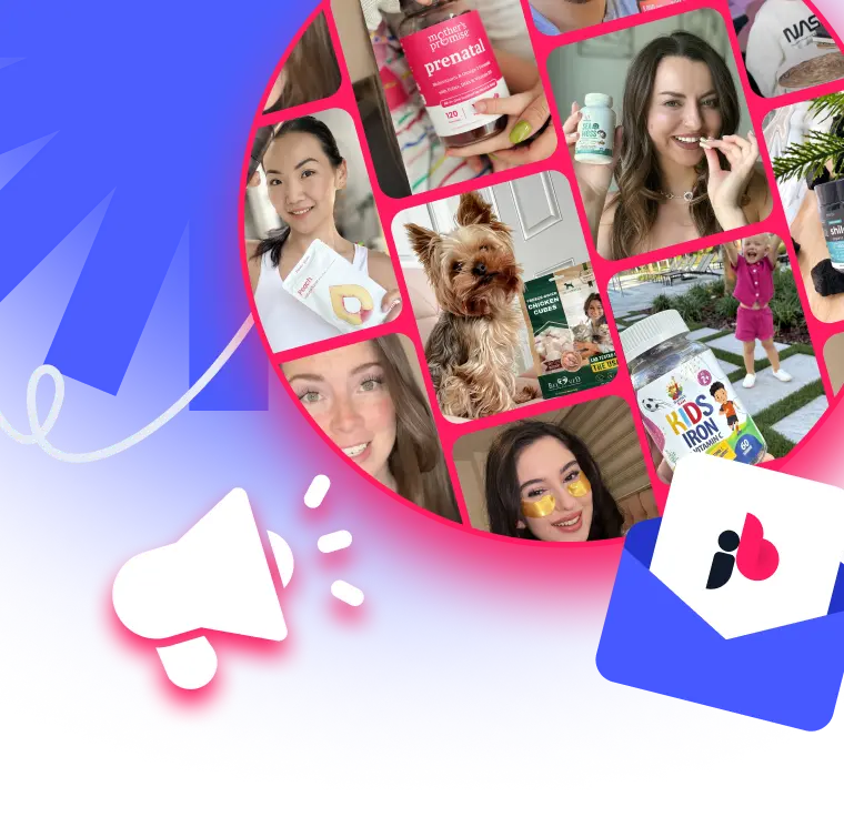
Accelerate your sales and amplify your social presence with JoinBrands. Our platform connects you with over 250,000 creators to generate high-performing content that drives results. Start your next campaign at https://joinbrands.com.