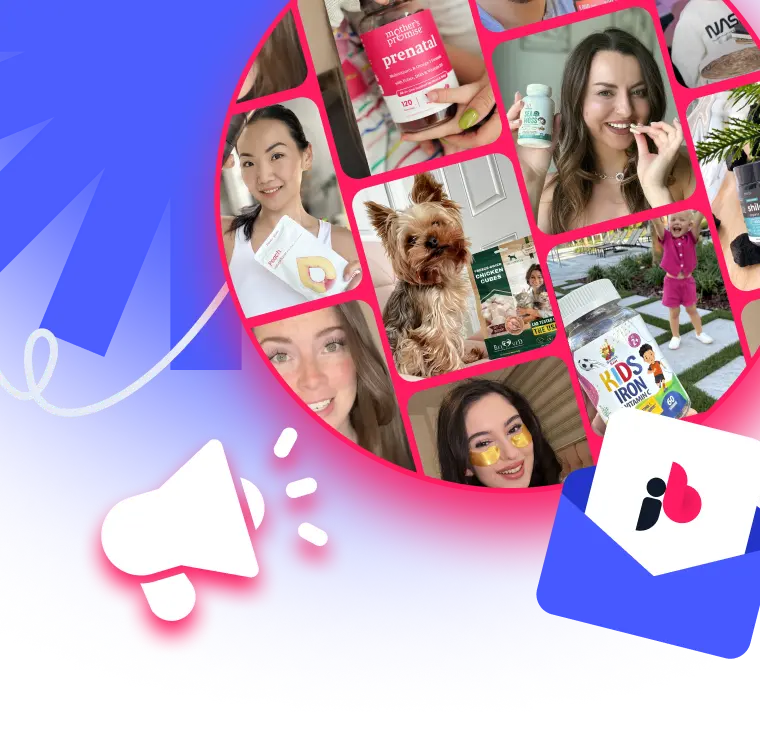

 Influencer Marketing on Tiktok: Master TikTok Influencer
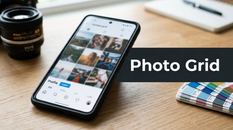
Most advice about a photo grid in instagram is outdated.
It still treats the grid like a storefront window. Make it pretty. Keep every tile perfectly matched. Obsess over row symmetry. Spend hours nudging one image so the checkerboard feels balanced. That used to be decent advice. It isn't enough now.
The better way to think about the grid is as a campaign asset. It's useful when it sharpens a launch, creates a branded moment, organizes a story, or helps a team coordinate a batch of content across paid, organic, and creator channels. It's far less useful when it becomes a design hobby that slows publishing and distracts from feed performance.
That distinction matters because the teams getting results from Instagram today don't build grids for vanity. They build them to support product drops, seasonal pushes, retail moments, founder stories, and creator-led campaigns that need a cohesive look fast.
Table of Contents
Rethinking the Instagram Grid Why They Matter in 2026
The popular claim is that your profile grid is the center of your Instagram strategy. It isn't.
According to Adtrak's analysis of real-world Instagram profile traffic, only 2% of views originated from the profile page over a 90-day period, and some international brands saw less than 1% of views from profile visits. That changes the whole conversation. Users generally aren't carefully browsing your profile. They're finding your content in-feed, through Stories, and through recommendations.
So why build a grid at all?
Because a grid still matters when you use it intentionally. Not as decoration. As structured brand signaling.
A strong grid does three jobs well:
- It creates context fast when someone does land on your profile after seeing a Reel, Story, or ad.
- It supports major campaign moments like launches, restocks, collabs, and rebrands.
- It forces internal discipline because your team has to align messaging, creative direction, asset specs, and publishing order before anything goes live.
That is where the value lies. A grid won't rescue weak creative. It won't fix bad hooks. It won't outperform a sharp Reel by itself. But it can package a brand narrative in a way that single disconnected posts can't.
Your grid is no longer the destination. It's the proof that your brand knows what it's saying.
That's why the best teams don't run a puzzle grid every week. They use grids selectively. They save them for moments that need more visual continuity than a one-off post can deliver.
If you treat the photo grid in instagram as a performance marketing layer, the decisions get easier. You stop asking, “Does this look aesthetic?” and start asking, “Does this support discovery, clarity, and conversion?”
Strategic Foundations for Your Instagram Grid
A bad grid usually starts with software. Someone opens Canva, chooses a template, and starts arranging tiles before anyone has decided what the campaign is trying to do.
A useful grid starts with a brief.

Pick the grid type based on the business goal
Different layouts solve different problems. Teams miss this all the time and default to whatever looks most impressive in a mockup.
Here's the practical breakdown:
| Grid style | Best use | Main trade-off |
|---|---|---|
| Puzzle grid | Product launch, rebrand, limited drop | Individual tiles can feel weak on their own |
| Checkerboard | Ongoing content cadence with quotes, product, lifestyle | Can become repetitive fast |
| Row-by-row theme | Storytelling, education, content pillars | Requires stronger editorial planning |
| Campaign burst grid | Event, sale, founder story, seasonal collection | Disrupts your normal feed rhythm |
If I'm working with a DTC brand launching one hero SKU, I usually push toward a campaign burst grid or a light puzzle approach. It gives the launch a defined visual block and makes the profile look intentional without forcing every future post into a rigid format.
If I'm working with a service brand or a niche B2B account, I prefer a row-based system. It's easier to sustain, and it plays better with educational content, proof points, and testimonials. Teams in regulated categories can borrow ideas from adjacent verticals too. For example, firms refining their visual identity and compliance-friendly posting rhythm can study these Instagram marketing tactics for lawyers and adapt the operational thinking, not just the industry examples.
Use an anchor instead of treating every tile equally
Not every post in a grid should carry equal visual weight.
The strongest structure for most brands is the 3×3 anchoring method. According to Alexis the Greek's guide to Instagram grid styling, the method places a hero image in the center tile and uses the surrounding eight posts to direct attention back to it. The same source notes that this 9-post batch planning model helps optimize scanning patterns and drive higher engagement.
That matters because viewers don't inspect a grid tile by tile. They scan. Fast.
Build the brief before the creative
A working grid brief should answer five things:
What moment are you packaging
New launch, founder announcement, collection refresh, sale, collab, retail placement, or educational series.
What must the audience understand at a glance
Product benefit, campaign name, offer logic, category position, or social proof.
Which tile is the hero
Usually the center tile in a 3×3. Sometimes the top-left if the profile already has pinned posts and fixed constraints.
What content mix fills the supporting tiles
Product detail, lifestyle, creator shot, quote card, feature callout, proof image, texture shot, and CTA card.
How long should the grid remain intact
A launch week, a month, or just long enough to establish the campaign before normal posting resumes.
Practical rule: if the campaign can't be explained in one sentence and mapped in nine assets, the brief is still too messy.
The strategy piece is where ROI starts. Good planning reduces design revisions, approval cycles, caption confusion, and last-minute posting errors. It also keeps the grid tied to something that matters commercially, instead of turning into a side project for the social team.
Designing Your Grid A Blueprint for Visual Storytelling
Once the strategy is locked, the creative work gets much easier. Most grid failures happen because teams jump straight into tile design without building a visual system first.
Start with one board, one palette, and one camera logic.

Build a mood board that narrows decisions
Use Pinterest, Milanote, or a locked brand board in Canva. Don't collect random inspiration. Collect references under specific buckets:
- Framing references for close crop, overhead, hands-in-frame, mirror shot, shelfie, product macro
- Lighting references for hard flash, soft daylight, shadow-heavy, studio clean
- Texture references for packaging, materials, surfaces, fabric, ingredients
- Typography references if the grid includes text-based posts
- Negative space references so designers know where copy can sit without fighting the image
This gives photographers, designers, and content coordinators a shared standard before anyone starts producing assets.
For brands managing cross-market teams, external support often becomes a necessity. A good example is content ops built for regional consistency. Teams producing social media content for Australian businesses often solve a problem global brands also face: maintaining one visual direction across different shoots, products, and local creative contributors.
Design for the vertical grid, not the old square mindset
This is the technical shift many teams still haven't fully absorbed.
According to Oktopost's Instagram grid size guide, Instagram changed its profile grid in early 2025 to a 4:5 aspect ratio, displayed at 3:4 in the grid preview. The same source states that the recommended upload size for feed posts is now 1080 x 1350 pixels, which gives vertical content 25% more screen real estate than square images. That shift aligns with user behavior because people create and consume content vertically on phones.
For design teams, the implication is simple. Stop composing grid campaigns like square posters chopped into pieces.
Use vertical-first compositions:
- Keep primary subjects taller in frame
- Let text blocks stack, not sprawl horizontally
- Avoid wide scenic layouts that collapse when cropped
- Place key visual information away from edge areas that may preview awkwardly
Oktopost's summary also notes strong performance signals for vertical formats, including 13.8% higher visibility on Facebook, 14% higher click-through rates for vertical videos on Instagram Stories, 90% brand recall for vertical videos versus 69% for horizontal, and 33% higher reach for vertical videos on Instagram Stories, citing Magna Global and HubSpot within its reporting. For a strategist, that doesn't mean every asset should become a giant vertical ad. It means the platform is clearly rewarding mobile-native composition.
Create a master visual system before individual tiles
In practice, I build the grid in this order:
Hero frame first
The center tile needs to carry the campaign. Product pack shot, founder portrait, headline card, or strongest lifestyle image.Support tiles second
These should answer obvious audience questions. What is it, why should I care, what does it look like in use, and what kind of brand is behind it.Bridges and separators last
Color fields, texture cards, quote posts, cropped details, or minimal type tiles that control pacing.
A good grid feels like one story with varied intensity. Not nine equally loud posts fighting each other.
Tool stack that works without slowing the team down
You don't need a huge stack. You need a reliable one.
For fast in-house teams
- Canva Pro for layout, versioning, approval comments, and resizing
- Lightroom for batch color correction
- Google Drive or Dropbox for asset handoff
- Notion for brief, shot list, and copy alignment
For heavier design control
- Adobe Photoshop for precise master artboards
- Illustrator for text-led campaign cards
- Lightroom Classic for color consistency across shoot days
- Figma if social, design, and paid teams need shared review links
Balance the grid like a merch table
Visual storytelling in a photo grid in instagram works best when you think like a merchandiser, not just a designer. You need rhythm.
Use this quick check before approval:
| Question | Good sign | Warning sign |
|---|---|---|
| Does one tile clearly lead? | Center or featured tile stands out | All tiles feel equally busy |
| Is there breathing room? | Some negative space exists | Every frame is full and cramped |
| Do colors repeat with control? | Palette feels deliberate | Random tones make the grid noisy |
| Do crops vary? | Mix of close, medium, and wide | Same framing repeated nine times |
A strong grid should still work when each tile gets separated in the feed. If individual posts are confusing on their own, the concept is too dependent on the profile view.
That's the core creative challenge. The full grid has to feel cohesive, but each post still needs enough independent value to make sense in-feed.
The Technical Workflow From Single Image to Seamless Grid
Execution is where many good concepts break.
The design looks sharp in a mockup. Then someone exports the wrong size, slices in the wrong order, uploads from a phone album full of lookalike files, and the live grid lands scrambled. That's avoidable if you use a rigid workflow.

Use one source file and one owner
One person should own the final export. Not the designer, the social manager, and the founder all saving their own versions to different folders.
My preferred setup is simple:
- Master file in Photoshop or Canva
- Final exports saved into a single folder
- Subfolder for approved captions
- Final posting order documented in Notion or a shared Google Sheet
For splitting, the easiest tools are Photoshop Slice Tool, Canva plus a grid splitter, or dedicated apps like Grids and Grid Post. Photoshop gives the most precision. Mobile apps are faster for solo creators. Agency teams usually benefit from desktop control because it reduces version confusion.
Name files for the posting order, not the design order
Here, discipline beats creativity.
Use a file convention like:
- CampaignName_09
- CampaignName_08
- CampaignName_07
- CampaignName_06
- CampaignName_05
- CampaignName_04
- CampaignName_03
- CampaignName_02
- CampaignName_01
Why reversed numbering? Because the final visual layout appears correctly only when you post in reverse order, from the last tile to the first. If you don't bake that into the filenames, someone will eventually post top-left first and break the sequence.
Run a dry test before anything goes live
Before launch, I always do three checks:
Preview check
Rebuild the grid in order in a planner or private deck.Crop check
Make sure each tile still looks intentional if someone sees it alone in-feed.Caption check
Confirm the caption assigned to each tile matches the visual and CTA.
This is a good point to review the actual upload motion.
Keep a rollback plan
Posting mistakes happen. The issue isn't whether your team makes one. It's whether you have a clean response.
If a tile goes live out of order, pick one of these paths fast:
- Delete and repost immediately if the campaign just started and the error is obvious
- Pause the full sequence if approvals or assets are now misaligned
- Switch to a soft launch if the grid no longer needs to appear perfectly intact
The cleanest grid campaigns are boring behind the scenes. Tight file names, one export owner, one posting order, and no improvising on launch day.
Publishing and Promotion Scheduling Captions and Hashtags
A grid campaign doesn't end when the files are ready. Publishing determines whether the concept lands as a sharp brand moment or as a confusing run of chopped-up images.
The biggest mistake is stretching a grid rollout over too much time. If the visual only makes sense as a complete unit, publish it in a tight window so followers and profile visitors see the campaign assembled quickly.
Schedule for coherence, not for comfort
Most brands should publish a grid burst close together. That keeps the visual intact and avoids a half-built profile sitting live for days.
If you're using Later, Buffer, or Meta Business Suite, set the sequence manually and double-check the order in the calendar view. I prefer building the posts in the scheduler, then comparing that queue against the exported file list and caption sheet one last time before approval.
Here's a practical comparison:
| Publishing approach | When it works | When it fails |
|---|---|---|
| All at once | Launches, announcements, rebrands, events | Can flood the feed if captions are weak |
| Tight staged rollout | Story-led campaigns with strong individual tiles | Risks confusion if spacing is too long |
| Slow drip | Rarely worth it for puzzle-style content | Audience sees fragments instead of the full idea |

Write captions like the tiles will be seen alone
It is important to recognize that users typically encounter an individual post in the feed, not the whole profile.
That means each caption should stand on its own. A few structures work well:
- Hero caption for the center post with the main campaign message, strongest CTA, and key product or brand framing
- Micro-story captions for surrounding tiles, each handling one angle such as benefit, ingredient, founder note, use case, or customer objection
- Utility captions for text cards or product detail tiles where the image is simple and the copy adds the meaning
What doesn't work is making all nine captions vague and relying on the assembled grid to explain everything.
Hashtag strategy should support discovery without hijacking the post
Hashtags on a grid campaign should be tighter than on regular publishing. You don't want nine nearly identical posts bloated with the same giant list.
A better system is to build three layers:
Core campaign tags
Brand, campaign name, product lineCategory tags
Descriptive tags that align with the product or content nicheContext tags
Seasonal, use-case, or audience-intent tags when relevant
Then rotate them. Keep the set close enough to support the campaign theme, but not so repetitive that every post looks copy-pasted.
Promote the grid beyond the profile
A grid is not self-distributing. Support it.
Use:
- Stories to drive viewers to the campaign block
- Pinned posts if one tile needs longer visibility
- Reels to explain the launch visually
- Paid amplification on the strongest individual tile, not necessarily the prettiest one in the assembled layout
The most effective grid launches usually pair one polished visual campaign with fast-moving supporting content around it. Static grid for authority. Stories for urgency. Reels for reach. Comments and DMs for conversion handling.
That combination gives the campaign a better chance to work as marketing, not just design.
Scaling Your Grid with Creators and UGC
A brand-only grid has one built-in limit. It reflects one camera, one team, and one perspective.
Creator content solves that, but only if you direct it tightly enough that the assets still feel cohesive when they land in the same visual system.

Brief for consistency, not uniformity
Most brands over-brief creators on wording and under-brief them on composition.
The better brief includes:
Color direction
Warm neutrals, high-contrast studio, clean white background, bold product tones, or whatever fits the campaignFraming guidance
Close-up hands, waist-up talking shot, overhead routine shot, unboxing sequence, shelf placement, or mirror selfieNegative space notes
Leave room top-left for text overlay, avoid cluttered backgrounds, keep product label fully visibleUsage direction
Organic feed only, paid usage, website, email, retail screen, or all-channel licensing depending on the agreementNon-negotiables
No competitor products in frame, no heavy filters, no tiny unreadable packaging, no dark lighting if the product needs detail visibility
That's how you preserve authenticity without getting a folder full of assets that can't live together.
Treat creator assets like a merchandising set
When UGC arrives, don't publish it in raw arrival order. Sort it into functions.
One creator asset might be best as the hero lifestyle tile. Another works as a close detail crop. Another becomes a quote card paired with creator copy. Another is stronger in Stories than in the grid.
This is especially useful when you're collecting visual contributions at scale from real communities. The operational logic isn't limited to e-commerce. Event marketers and wedding planners use the same principle when they Collect wedding photos from guests and then organize those assets into a coherent visual experience instead of a random camera roll dump.
Build your own performance dataset
There's still a real knowledge gap here. According to the background point documented in this discussion of the industry gap around grid layout, algorithm impact, and creator earnings, brands don't yet have enough clear data on how specific grid layouts directly affect recommendation performance, reach, or creator economics.
That's a problem, but it's also an advantage for disciplined teams.
If you work with creators, start testing your own variables:
| Test variable | Version A | Version B |
|---|---|---|
| Grid consistency | Cohesive campaign palette | Mixed visual styles |
| Hero tile type | Product-first | Creator-first |
| Support structure | Educational cards | Lifestyle-only sequence |
| Promotion layer | Grid plus Stories | Grid plus Reels |
You don't need public industry benchmarks to learn something useful. You need a repeatable process and clean naming across campaigns so your team can compare outcomes internally.
Brands that brief creators well and track grid experiments over time will learn faster than brands still debating whether the feed should be beige or colorful.
That's the effective scaling play. Not more content for the sake of volume. Better inputs, cleaner assembly, and a stronger feedback loop between creative decisions and business outcomes.
Frequently Asked Questions About Instagram Grids
Should every brand use a puzzle grid
No. Most brands shouldn't run one continuously.
Puzzle grids are best for contained moments like launches, rebrands, seasonal stories, or milestone announcements. If you force that format into everyday publishing, the feed often becomes harder to manage and individual posts lose strength.
What's the best size for a photo grid in instagram
Design your feed posts at 1080 x 1350 pixels and compose with a vertical-first mindset, as covered earlier from the Oktopost reference. That gives you more room to work with and fits how Instagram now presents feed content and grid previews.
If your team still designs everything as square-first, update the templates before the next campaign.
How many posts should I plan at once
For a full visual grid, planning in batches is cleaner than improvising post by post.
The most practical unit is a 3×3 block because it forces message discipline and gives you enough tiles to establish a visual pattern. Even if you don't launch all nine posts as one cohesive puzzle, thinking in batches helps maintain consistency.
What if one post goes live in the wrong order
Fix it quickly. Don't leave the mistake sitting there while the team debates.
If the campaign is highly visual and sequence-dependent, delete and repost in the correct order. If the tiles still make sense individually, you may be able to continue and repair the pattern with the next posts. The right call depends on how much the visual continuity matters to the campaign.
Should captions all tell one story or work independently
They should do both, but independent clarity matters more.
Each caption needs to make sense to someone seeing only that one tile in the feed. The series can form a larger narrative, but don't make the audience assemble a puzzle just to understand the post.
Do hashtags matter for grid campaigns
Yes, but only when they support relevance.
Use a small, intentional mix tied to the campaign, category, and audience context. Don't paste the same bloated hashtag block onto every tile. That makes the campaign look automated and weakens the editorial feel.
Can I mix product photos, graphics, and creator content in one grid
Yes, and most high-functioning brand grids should.
The trick is to control the system. Keep the palette, spacing, crop logic, and type treatment aligned so the content feels orchestrated instead of random. A mixed-media grid often performs better creatively because it gives viewers contrast while keeping the campaign theme intact.
How long should I keep the grid intact before returning to regular posts
Long enough for the campaign moment to register. Not so long that the profile feels frozen.
For some launches, that may be a short burst. For a rebrand or major narrative shift, the campaign block may stay relevant much longer. The deciding factor is whether the grid still supports the current business priority.
If you want to run creator-led Instagram campaigns without juggling briefs, asset collection, approvals, and performance tracking across five separate tools, JoinBrands gives brands one place to source creators, manage UGC production, organize deliverables, and scale content that fits a structured social strategy.